Building an evolving wellness ecosystem.
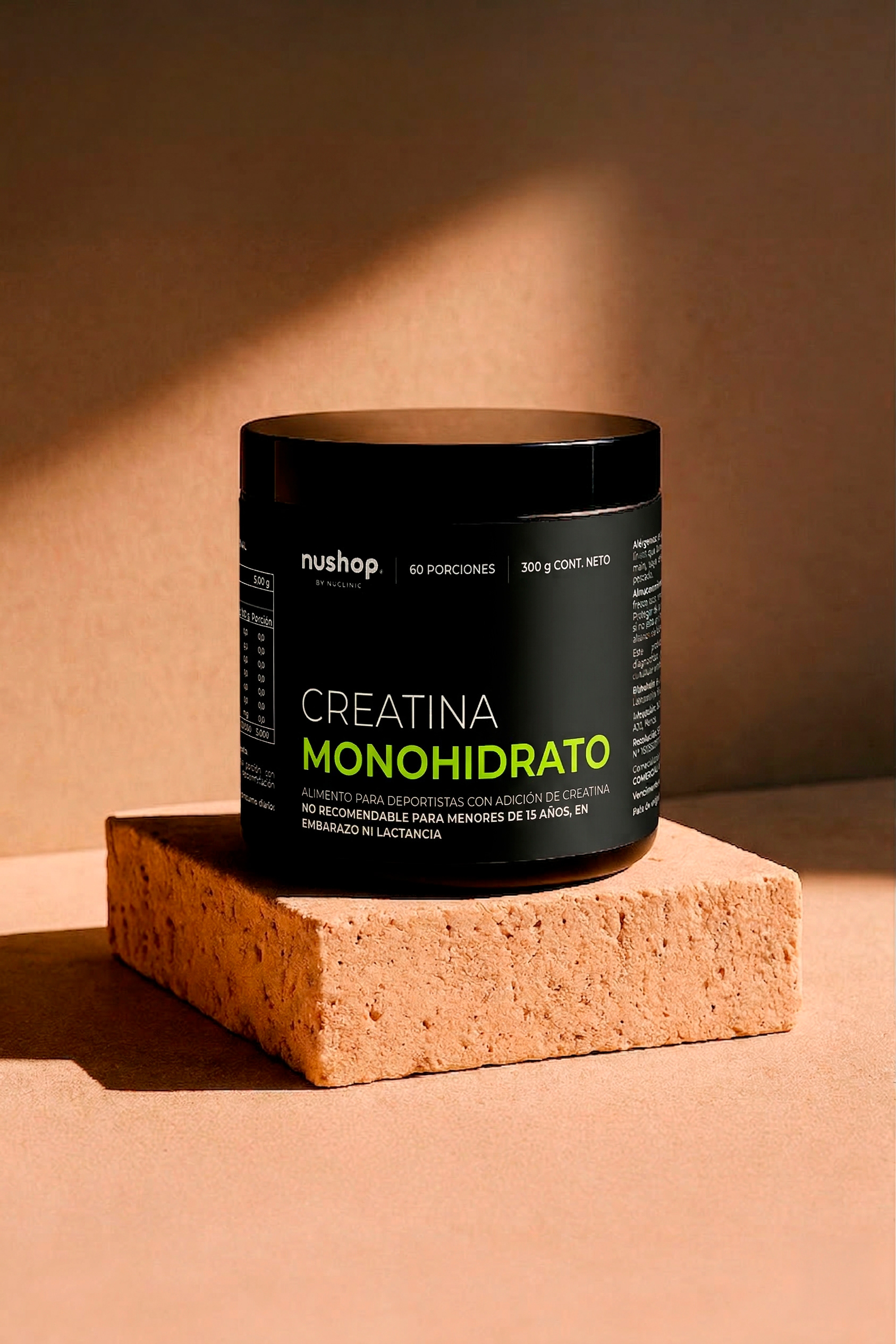
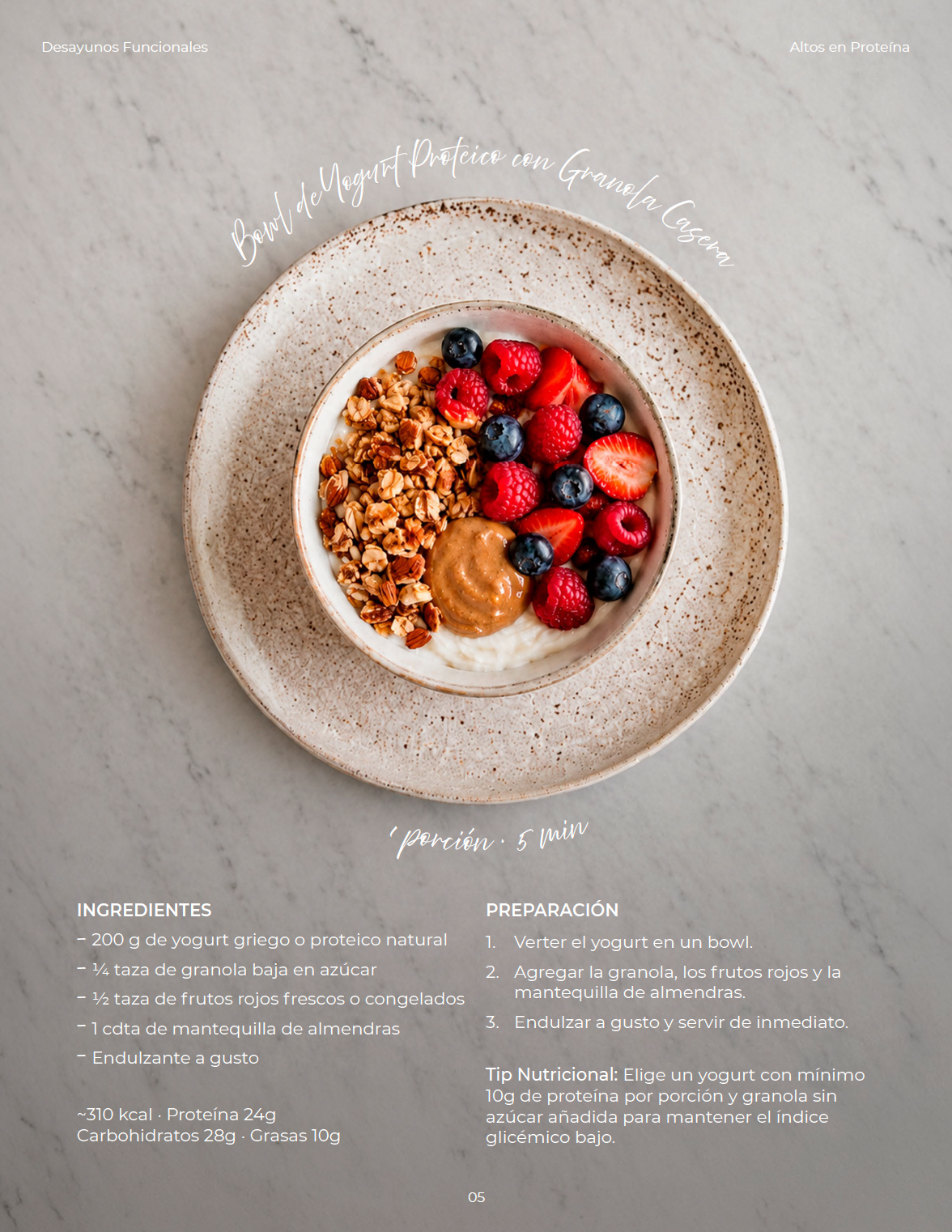
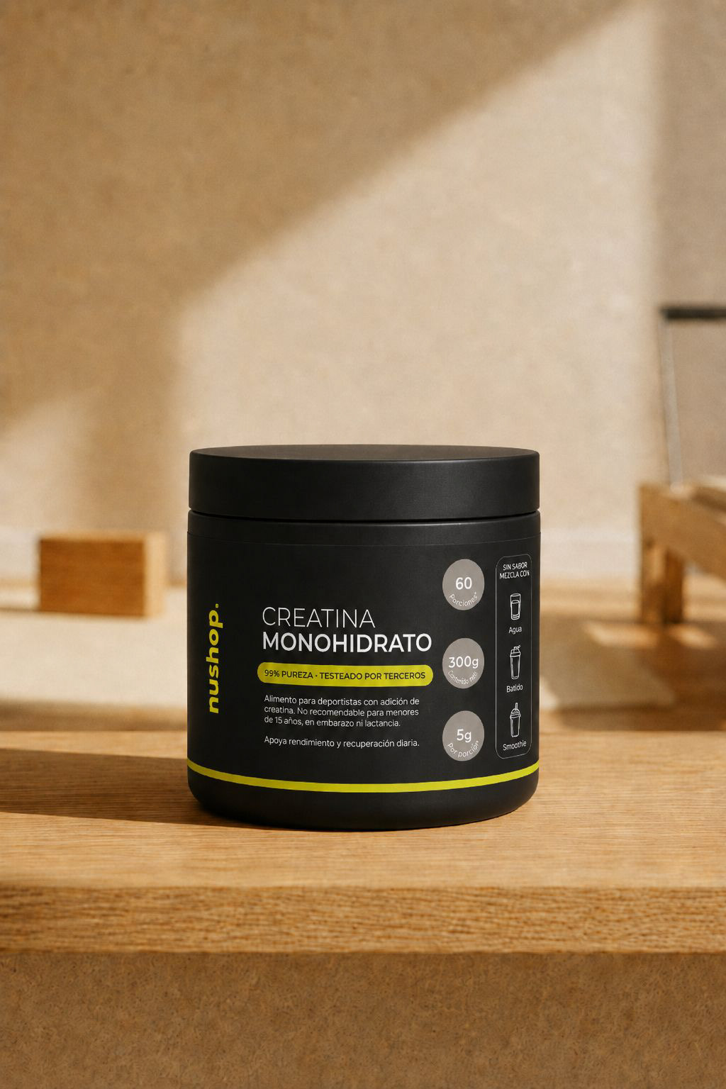
Brand development across packaging, editorial design, digital content and product launches.
The Problem
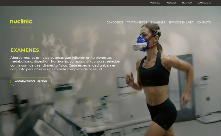
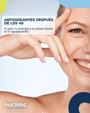
NuClinic operated with the visual language of institutional healthcare: electric blue, flat photography, promotional graphics. In a market where patients increasingly choose their clinic the way they choose a lifestyle brand, that language was working against them.
The Creative Decision
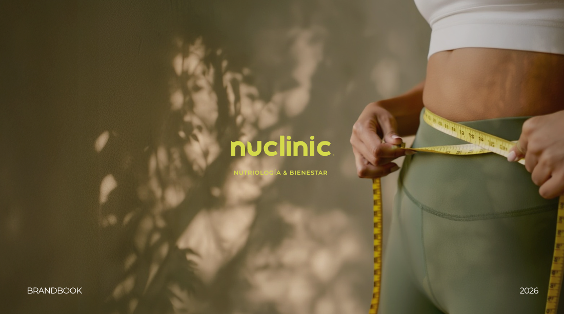
The brief asked for "warmer and closer." The challenge was to reframe medicine entirely: not as a transaction, but as internal transformation. The concept "Desde tu interior, hacia resultados clínicos sostenibles" became the axis for every visual and verbal choice that followed.
This meant rejecting both extremes: the cold authority of clinical aesthetics and the superficiality of generic wellness, and finding the tension between the two: the warmth of wellbeing with the precision of medical evidence.
What Changed
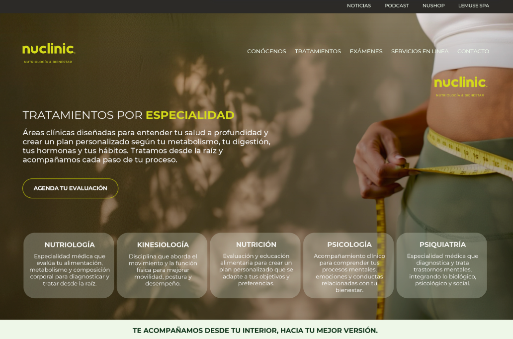
Same logo. Entirely new world around it. Deep forest greens and warm neutrals replaced the clinical blue — a palette that communicates trust without coldness. Photography direction shifted from stock smiles to intimate, body-aware imagery. Tone of voice moved from informative to accompanying. The system was designed to work across both brands simultaneously, NuClinic and NuShop share a visual DNA without losing individual identity.
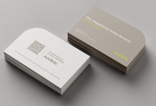
Full delivery: brand manual, color system, typography, art direction guidelines, photography direction, web, and social content templates.
NuShop launched. NuClinic rolling out. The founder, with a significant social following, is actively applying the new language across channels, with ongoing creative direction.
Before Brand Refresh
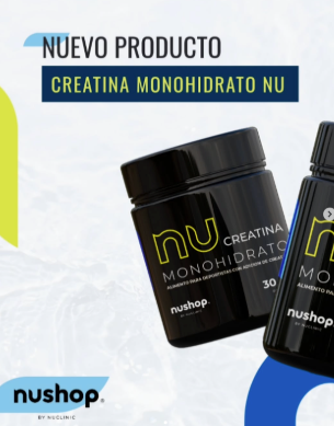
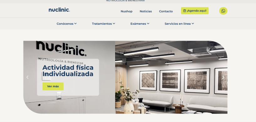
After Brand Refresh